2Discipline
Initial situation
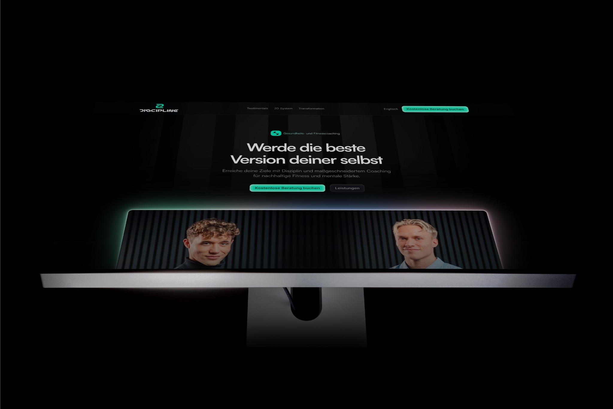
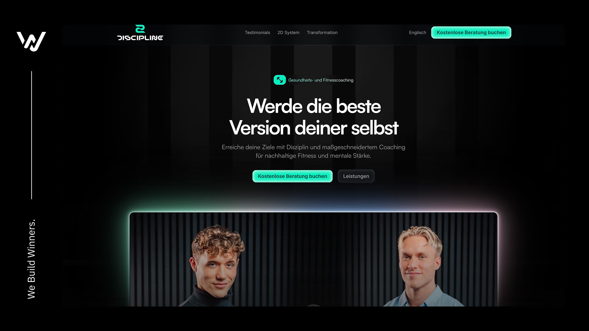
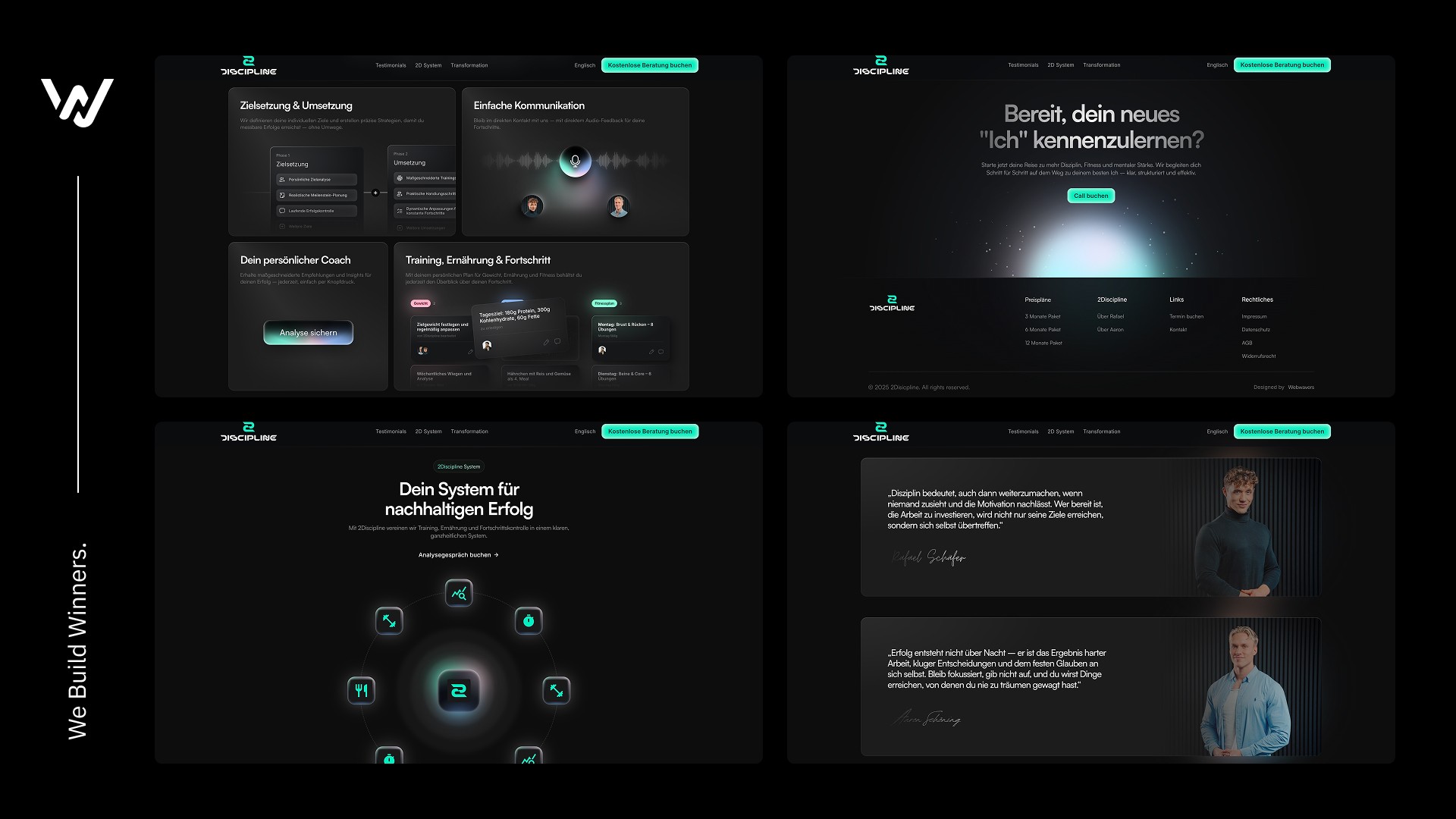
For 2Discipline, the brand was developed from the ground up. The goal was to translate the essence of discipline, professionalism and a personal signature into a clear visual identity. The branding was meant to reflect both the content focus and the personalities of the founders. At the center was the development of a strong corporate design including logo, typography, color palette and merchandise. The landing page was deliberately designed to drive sales, positioning the brand clearly and presenting the services in an understandable and convincing way.
Challenge
Approach & Solution
The central element of the branding is the custom logo, in which the “D” in “Discipline” can also be read as the number “2”: a visual symbol for the two founders, Aaron and Rafael. This mark combines meaning, recognizability and brand story in one clear form.
Result
The landing page consistently picks up the branding and translates it into a modern, structured user experience with a clear focus on conversion. The result is a coherent brand presence that combines professionalism and individuality and establishes 2Discipline as a distinctive, clearly positioned brand. The project shows how strategic branding and digital design work together to make brand identity visible and strengthen it for the long term.
Testimonial
Insights