NetConnection
NetConnection
NetConnection
NetConnection
Company
Company
Netconnection GmbH
Netconnection GmbH
Year
Year
2026
/
2026
2026
Services
Services
Corporate Identity
Corporate Identity
About the project
About the project
About the project
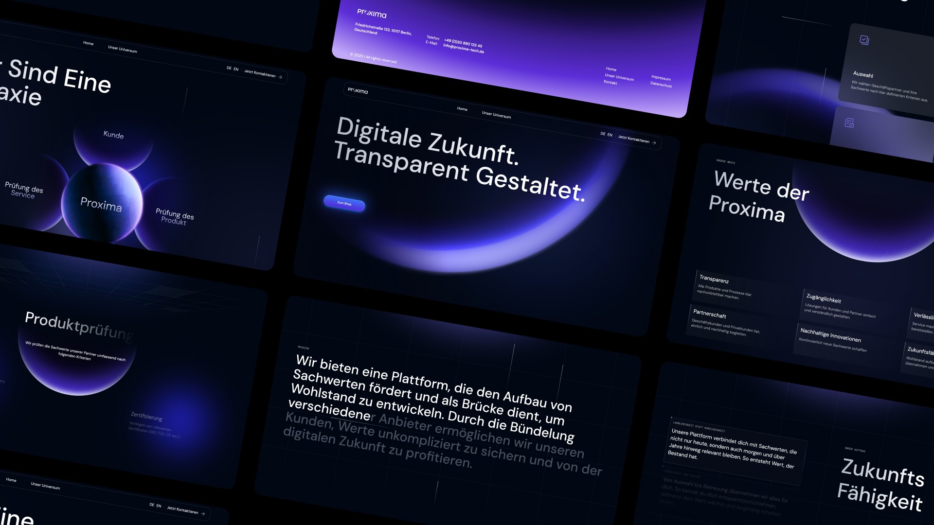
Netconnection is a SaaS platform for the automotive trade—it connects vehicle data, sales processes, and marketplace distribution in one integrated system. The company was already established in the market, but needed a visual identity that matched the platform’s ambitions. Webwavers developed a rebranding that clearly positions Netconnection at the intersection of automotive and tech—precise, modern, and recognizable.
Netconnection is a SaaS platform for the automotive trade—it connects vehicle data, sales processes, and marketplace distribution in one integrated system. The company was already established in the market, but needed a visual identity that matched the platform’s ambitions. Webwavers developed a rebranding that clearly positions Netconnection at the intersection of automotive and tech—precise, modern, and recognizable.

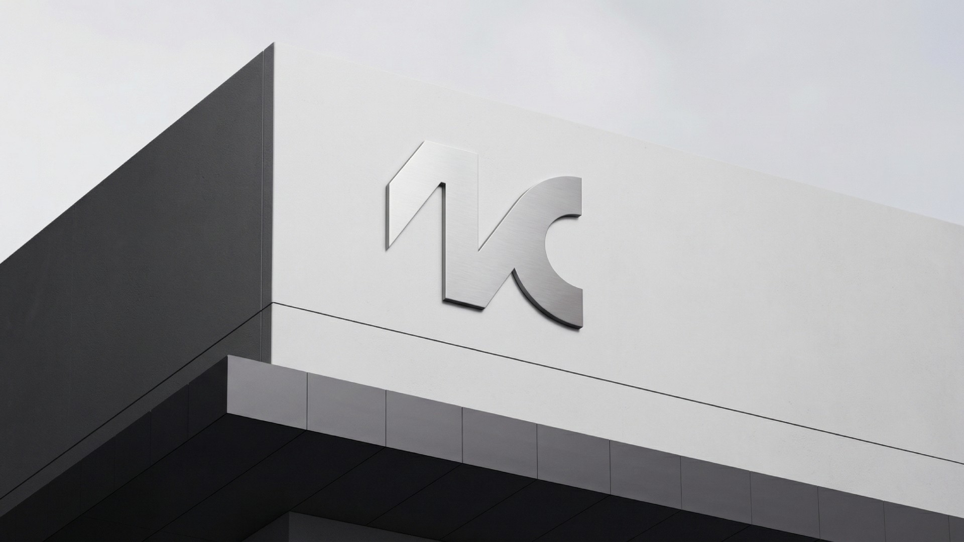


The trademark is a monogram made of “N” and “C,” constructed as a continuous, flowing form. Angles and curves interlock—without interruption, without breaks. This construction logic is not a decorative detail, but a direct visual translation of what Netconnection does: seamlessly connecting systems, data, and processes. The symbol works just as confidently as a standalone signet as it does as part of the full logo.
The trademark is a monogram made of “N” and “C,” constructed as a continuous, flowing form. Angles and curves interlock—without interruption, without breaks. This construction logic is not a decorative detail, but a direct visual translation of what Netconnection does: seamlessly connecting systems, data, and processes. The symbol works just as confidently as a standalone signet as it does as part of the full logo.
The lowercase wordmark gives the brand a more human touch—technical expertise without feeling cold. The color palette of teal, dark green, and mint creates depth and movement, translates the idea of data flow into color, and clearly positions Netconnection visually within the SaaS environment. Glancyr as the headline typeface and DM Sans for body text form a system that works equally well in the interface and in marketing materials.
The lowercase wordmark gives the brand a more human touch—technical expertise without feeling cold. The color palette of teal, dark green, and mint creates depth and movement, translates the idea of data flow into color, and clearly positions Netconnection visually within the SaaS environment. Glancyr as the headline typeface and DM Sans for body text form a system that works equally well in the interface and in marketing materials.
Other projects
Other projects
Other projects
Other projects