References
Corporate Identity
MSP
https://cdn.prod.website-files.com/6ace62622eb5cd24f1dcbe0d/6acf7748493cb2896a90d0a4_p2-work-msp-hero-fs.mp4
Initial situation
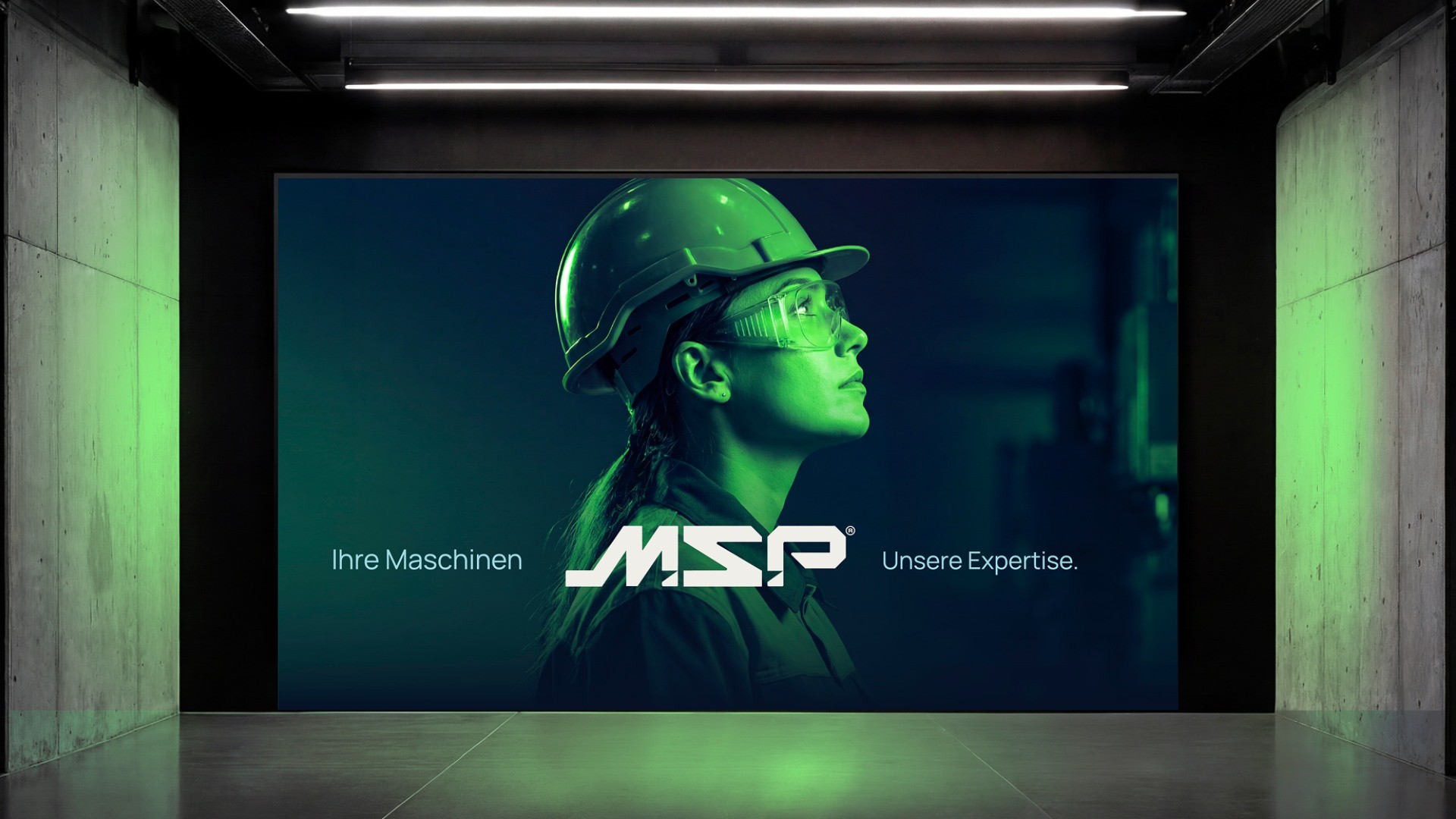
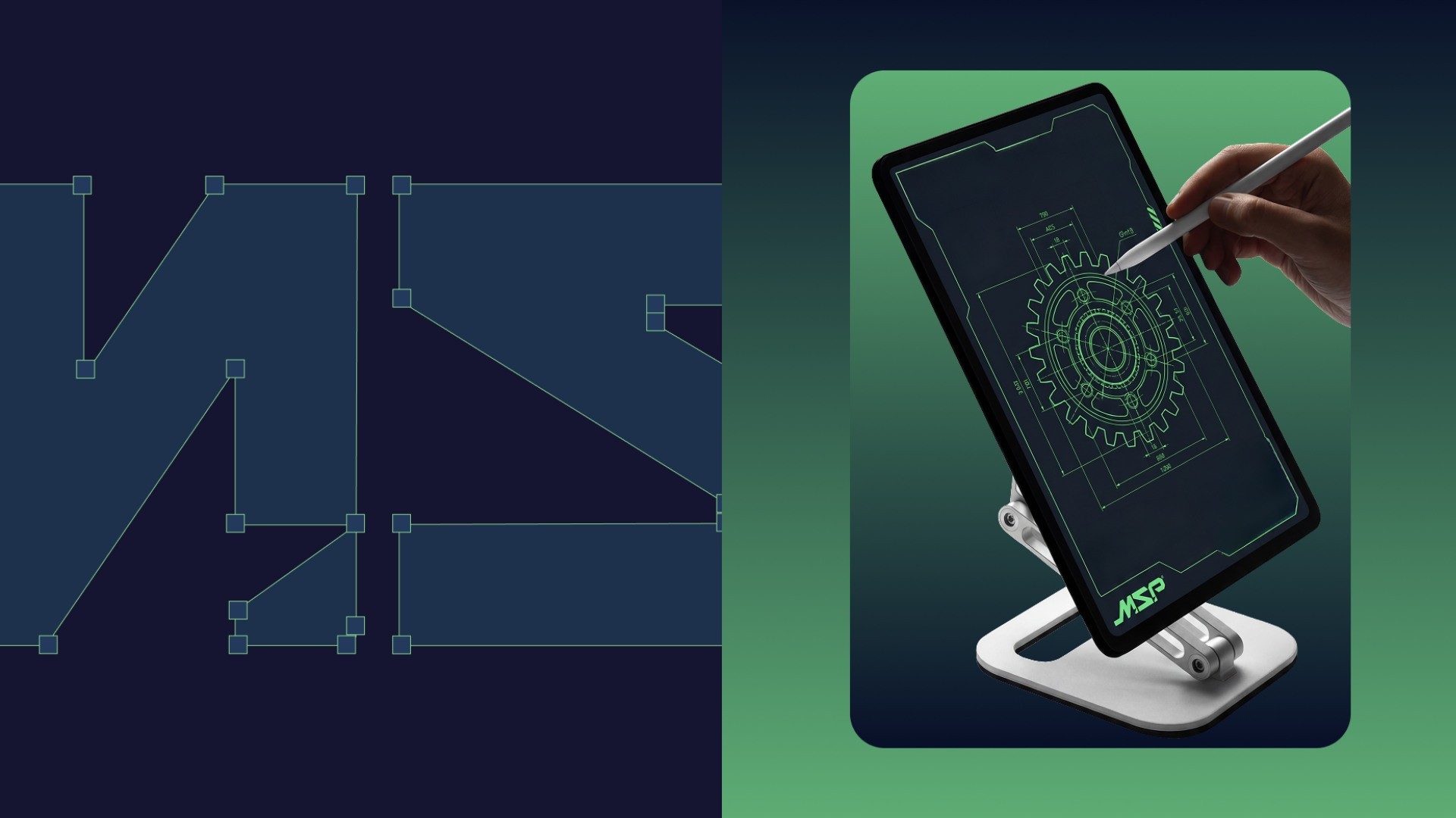
The MSP rebranding aims to make technical expertise visible in a clear and understandable way. The visual identity is industrial, precise and functional. Clear shapes, structured surfaces and a technically inspired color palette reflect processes, efficiency and reliability.
Challenge
Approach & Solution
Result
The new corporate identity positions MSP as a modern, forward-looking industrial brand.
It creates clarity, recognizability and a stable foundation for the website currently in progress. Branding and digital applications interlock consistently.
Testimonial
Insights