References
Rebranding
Sovique AG
https://cdn.prod.website-files.com/6ace62622eb5cd24f1dcbe0d/6acf774b6f334841fe416c48_p2-work-sovique-ag-hero-fs.mp4
Initial situation
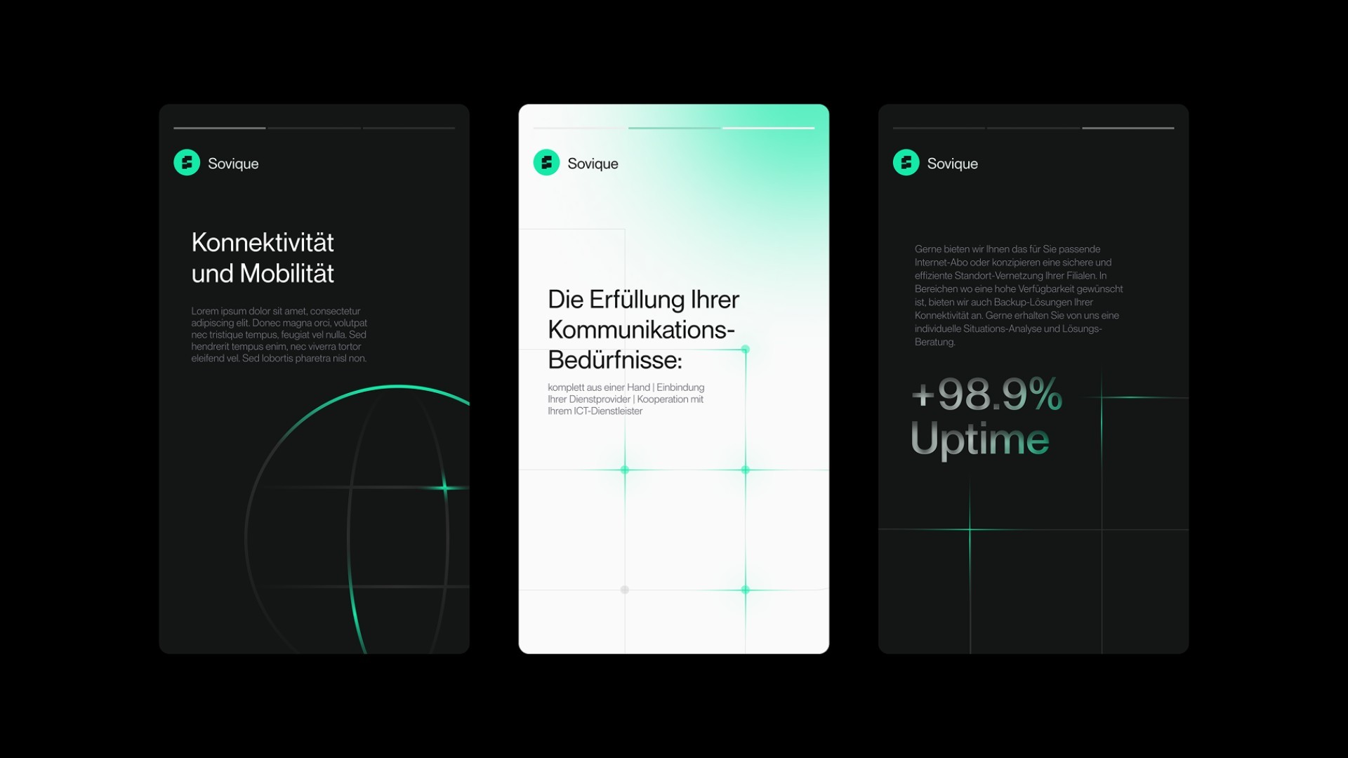
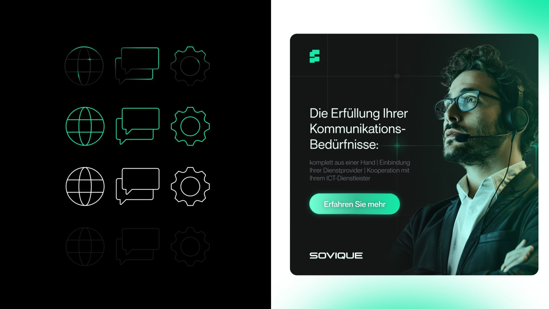
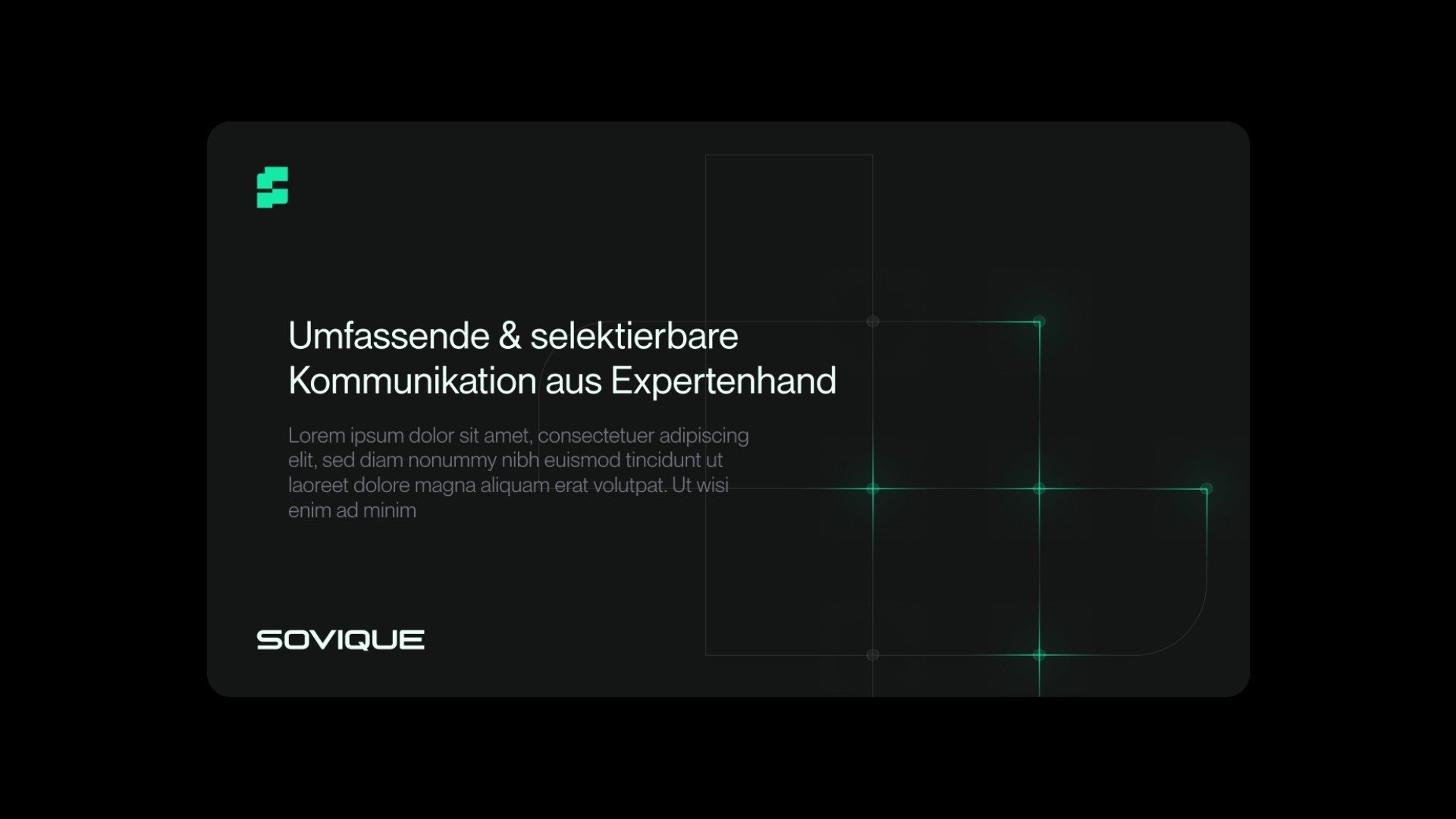
The Sovique branding was deliberately evolved to make connectivity, communication and technological expertise more clearly visible. The visual language is based on systematics, modular shapes and a technically inspired color palette. The goal was to make structure and reliability immediately tangible.
Challenge
Approach & Solution
Result
The Sovique corporate identity forms a clear, consistent brand world and serves as the foundation for the web design and Webflow development currently being built.
Sovique positions itself as a modern, technology-focused provider with a clear visual stance.
Testimonial
Insights