Atoria Real Estate
Atoria Real Estate
Atoria Real Estate
Atoria Real Estate
Company
Company
Atoria Real Estate GmbH
Atoria Real Estate GmbH
Year
Year
2026
/
2026
2026
Services
Services
Corporate Identity
Corporate Identity

About the project
About the project
About the project
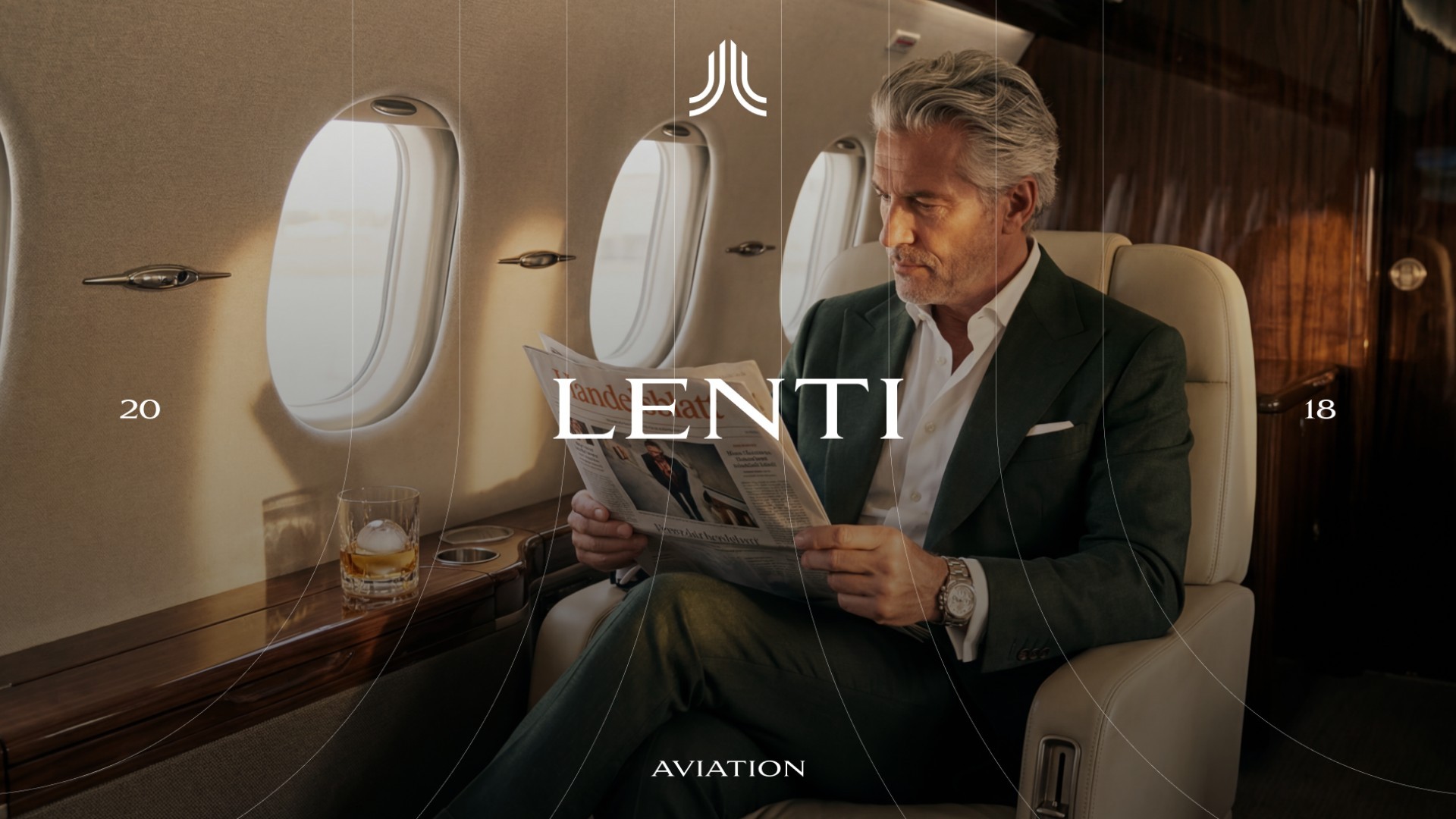
A corporate identity was developed for ATORIA that combines architecture, quality, and leadership in a clear, timeless design language. The core branding idea is based on structure, precision, and authority—translated into a visual system that is deliberately pared back and avoids overt symbolism. Instead, it creates a strong, distinctive identity that conveys stability, trust, and sustainable growth. The overall look is calm, premium, and confident without feeling distant. Visually, this concept was translated into a clear, architecturally influenced formal language that unites durability and modernity. In this way, ATORIA positions itself as a premium brand with substance and long-term ambition.
A corporate identity was developed for ATORIA that combines architecture, quality, and leadership in a clear, timeless design language. The core branding idea is based on structure, precision, and authority—translated into a visual system that is deliberately pared back and avoids overt symbolism. Instead, it creates a strong, distinctive identity that conveys stability, trust, and sustainable growth. The overall look is calm, premium, and confident without feeling distant. Visually, this concept was translated into a clear, architecturally influenced formal language that unites durability and modernity. In this way, ATORIA positions itself as a premium brand with substance and long-term ambition.


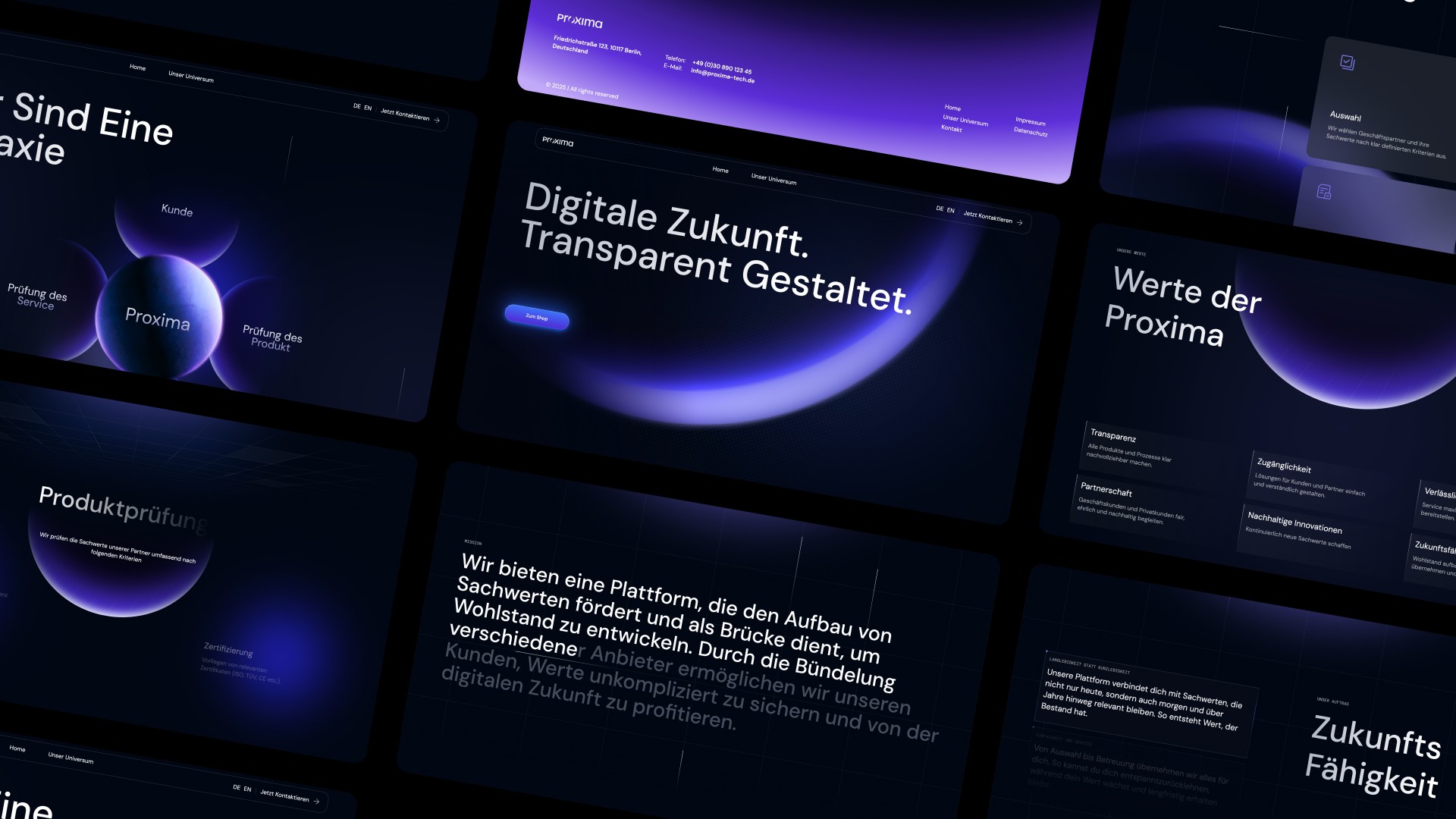
ATORIA’s branding is designed as a structured, consistent system built for longevity and recognizability. The logo, typography, and design elements interlock precisely, creating a clear, calm brand image across all applications.
ATORIA’s branding is designed as a structured, consistent system built for longevity and recognizability. The logo, typography, and design elements interlock precisely, creating a clear, calm brand image across all applications.
The visual identity conveys security, professionalism, and trust, and supports positioning in the premium segment. As a result, ATORIA does not present itself loudly, but convincingly—with a brand presence that endures and has a lasting impact, digitally as well as physically, today and in the future.
The visual identity conveys security, professionalism, and trust, and supports positioning in the premium segment. As a result, ATORIA does not present itself loudly, but convincingly—with a brand presence that endures and has a lasting impact, digitally as well as physically, today and in the future.
Other projects
Other projects
Other projects
Other projects