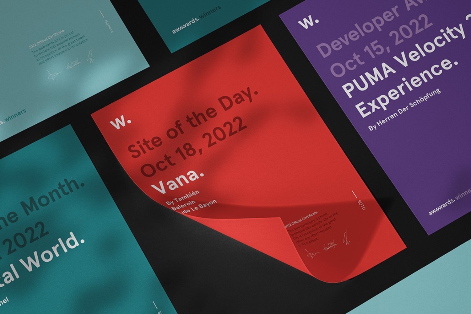
Awwwards International Design Recognition
Key takeaways
- Recognized: Seconds for BMI Lab AG
- Judged by an international expert jury
- Four criteria: Design, Usability, Creativity, Content
- Design: Cee Cee Creative. Development: Webwavers.
Awwwards: how an international jury judges web design
Awwwards judges digital projects from an international perspective. The jury looks at four areas: Design, Usability, Creativity and Content. This means no single detail decides, but the interplay of visual quality, intuitive use, an original idea and relevant content.
For Seconds, which we built for BMI Lab AG, exactly this combination was central. The site had to convey a clear brand, feel intuitive and make the character of the project visible in every movement and every detail. The award is therefore less a seal for a beautiful screen than a confirmation that concept and execution fit together.
An international rating is meaningful precisely because it works without context. Nobody on the jury knows the brand, the budget or the story behind it. All that is judged is what happens on screen.
The four criteria of an Awwwards rating
The rating covers four dimensions with different weights. Design and usability carry the most weight, with creativity and content added on top. What looks like a design question at first glance is really a question of overall quality.
Design
Composition, typography, color, imagery, attention to detail. This doesn't mean opulence, it means consistency. A jury can tell within seconds whether there is a system behind it or whether every page was decided from scratch. This is exactly where most submissions fail, not for lack of ideas.
Usability
Load time, navigation, readability, behavior on small screens, response to input. An elaborate site that feels sluggish or loses its structure on a phone loses a lot of points here. Usability is not the opposite of design, it is part of it.
Creativity
Did someone have an original thought? The idea is judged, not the number of effects. An unusual navigation that grows out of the content counts for more than ten animations that happen to sit next to each other.
Content
Do copy, images and structure fit together, and do they carry the message? A perfectly built site with placeholder text stands out. Content is the criterion that is most often underestimated in practice, also outside of awards.
The total decides
Because an average is calculated from all four scores, nobody gets through with a peak in a single category. A site that shines visually but loses two seconds when loading ends up in the middle of the field. That is why awards like this say something about an agency's way of working and not just about its taste.
What was judged about "Seconds"
Seconds supports organizations at the points where decisions are made. The brand message is "Creating Pivotal Seconds That Move Organisations". The site was not supposed to claim this attitude but make it tangible, and that is exactly what it was measured against.
A concept that comes from the subject
The design reflects the way an innovation consultancy works: analytical, methodical, structured. Nothing is placed for decoration. In an international rating, that is the decisive difference between a site that looks modern and one that is distinctive.
Interaction with a function
The design works with interactive modules and finely tuned transitions. Every movement creates a connection instead of claiming attention for itself. In the details, that is far more complex than a site that simply animates a lot.
A structure that holds up
Insights, Cases and Services are clearly separated and still read as one line of thought. A consultancy sells judgment, and judgment shows in the order: what comes first, what sits alongside, what is deliberately left out.
Execution without compromise
Our task was the technical build in Webflow: pixel-perfect to the design, with all animations and modules, without sacrificing performance or usability. In the rating, exactly this pays off in usability and design at the same time.
What you can do to meet this standard
You don't have to submit anything to benefit from the criteria. They describe quite precisely how a visitor judges a website too, just faster and unconsciously. Five points that make the difference in practice.
1. A system instead of individual pages
Define spacing, font sizes, colors and building blocks once and stick to them. Consistency looks more expensive than any single beautiful detail, and it makes later changes cheaper.
2. Treat load time as a design question
Image sizes, font loading, the order of content: these are decisions made while building. If you only tackle performance after launch, you usually postpone it indefinitely.
3. Use motion sparingly and for a reason
Every animation needs a job: showing a connection, explaining a sequence, confirming a response. Everything else costs load time and attention.
4. Check on small screens first
Most visitors come on mobile. A site that only works on a large monitor doesn't just lose in a jury rating, it loses real inquiries every day.
5. Define content before design
If you design with placeholders, you design for text that doesn't exist. As soon as the real content arrives, the hierarchy no longer fits. The content is the design, everything else is its form.
What an international award really means
It is an outside view
Within a project, you get used to everything. A jury that doesn't know the brand sees only the result. That view is uncomfortable and therefore valuable. Even without a submission, it is worth seeking it out regularly.
It says something about the collaboration
A result at this level doesn't come from one discipline. Design and build have to take each other seriously. Where the handover works, the design is preserved right to the end.
Conclusion
For us, the recognition is not a trophy but a confirmation: our standards are seen beyond the German-speaking market. And it is a benchmark we measure every further project against, regardless of whether it is ever submitted.


More articles