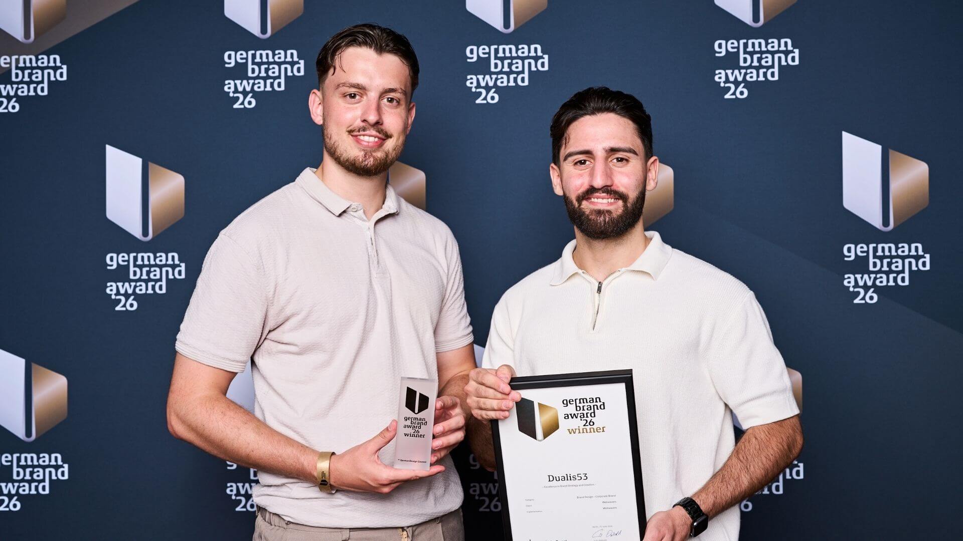
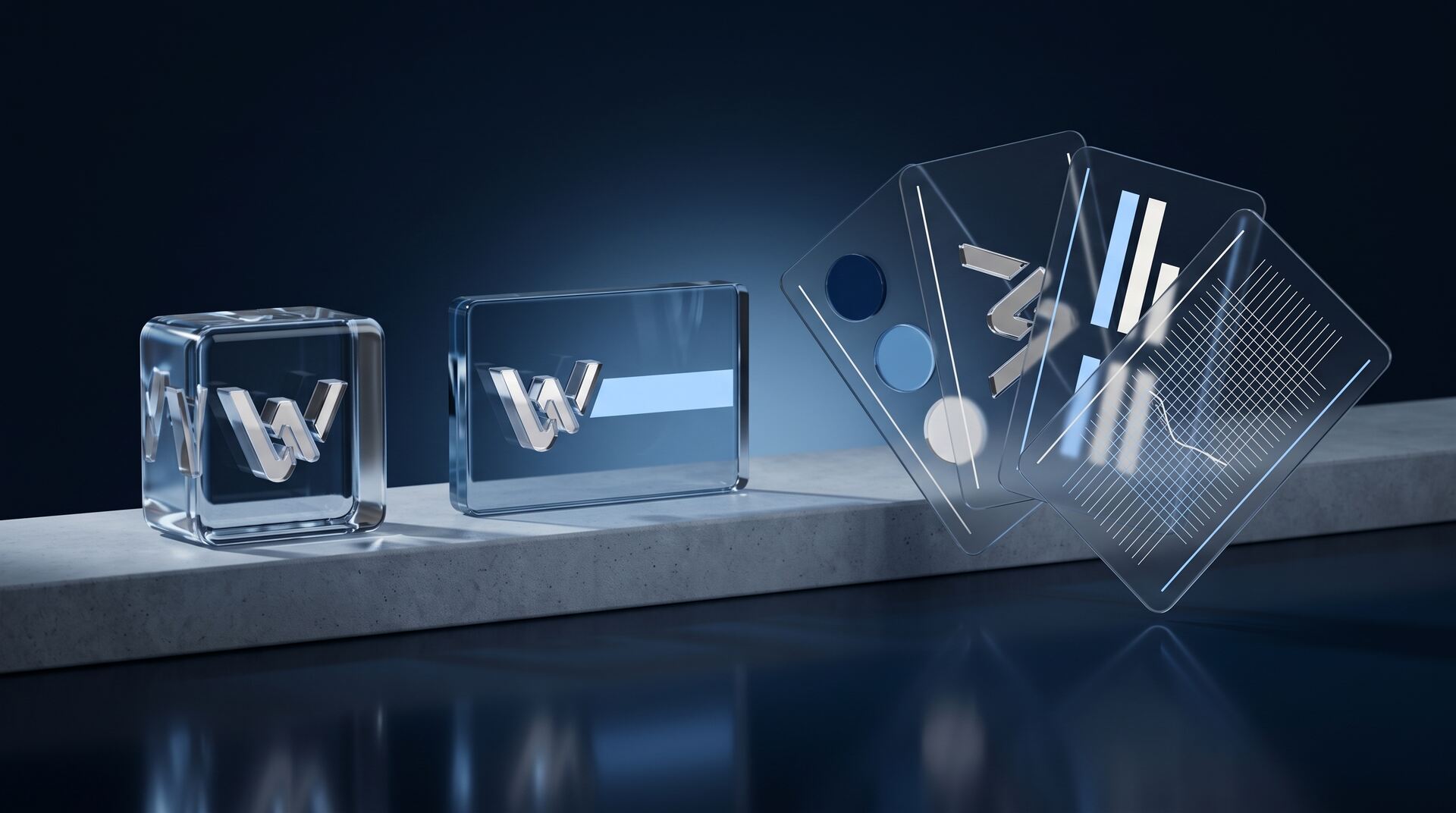
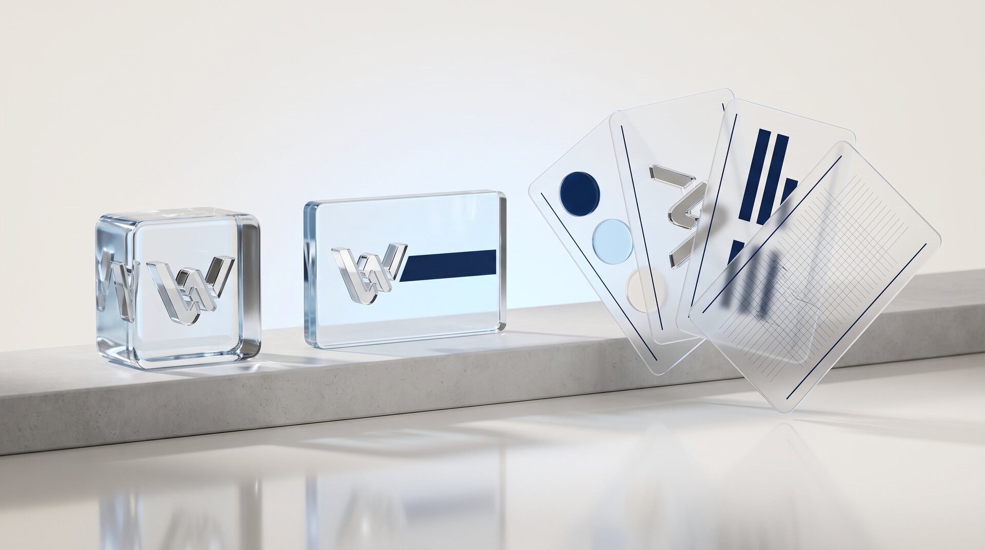
German Design Award Winner 2026 - Category Excellent Communications Web

Key takeaways
- Category: Excellent Communications Design – Web
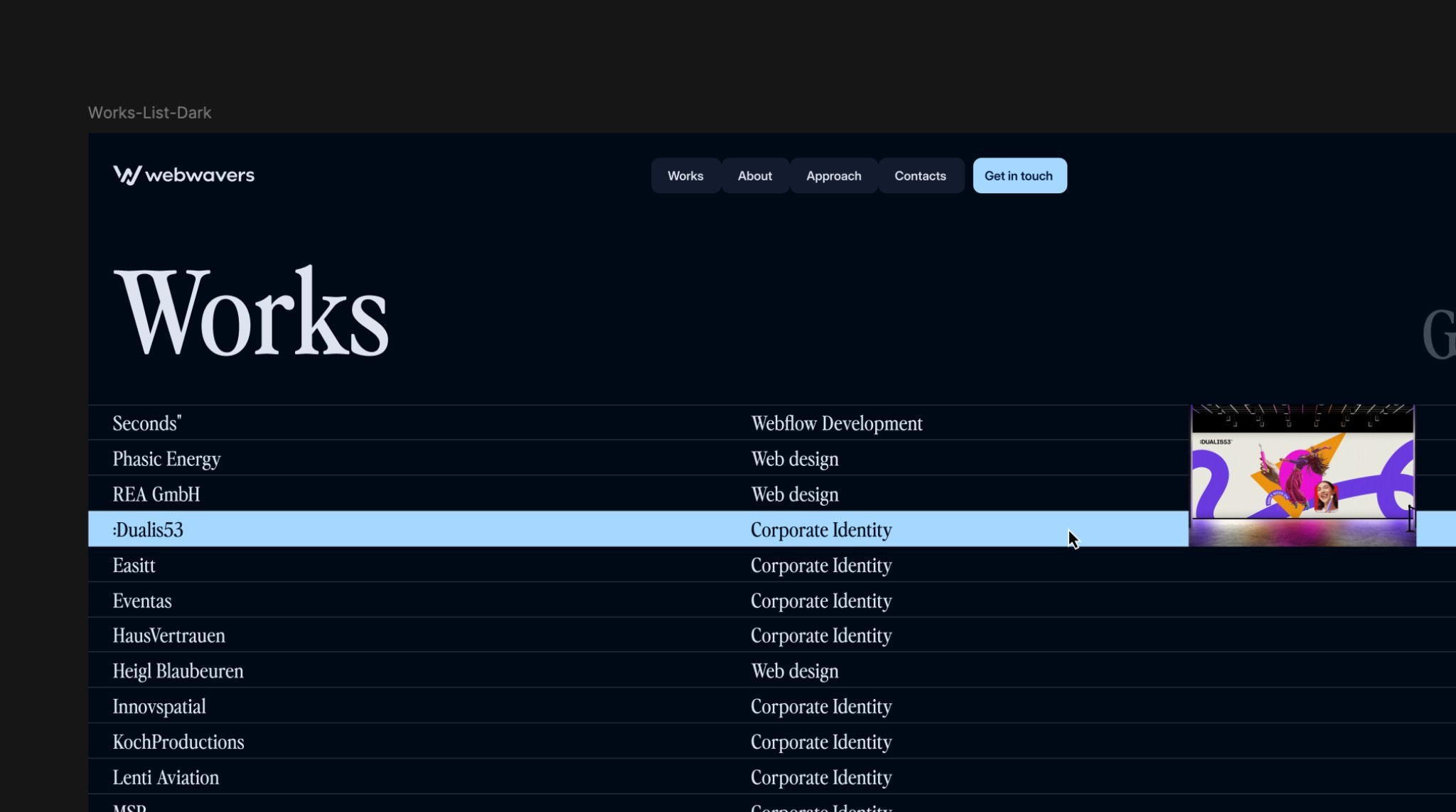
- Project: Seconds for BMI Lab AG, Berlin
- Design: Cee Cee Creative. Development: Webwavers.
- Design, craftsmanship and impact are judged
German Design Award 2026: what the jury recognized in "Seconds"
The German Design Award is one of the most renowned awards for design quality. It is presented by the German Design Council (Rat für Formgebung), an institution that has existed since 1953 and whose juries are international. An award in the category Excellent Communications Design – Web therefore doesn't mean a site is pretty. It means a jury of designers and strategists has concluded that communication works here.
In 2026, the award went to the website of Seconds, an innovation consultancy from Berlin backed by BMI Lab AG. The design comes from the agency Cee Cee Creative, the technical build from us. This article explains what was recognized in the project, what a jury like this actually measures and what you can take away for your own presence, even without any ambitions to win an award.
An award for communication design doesn't measure how good a website looks. It measures whether what a brand stands for actually comes across to the viewer: in structure, pace and detail.
How a jury judges a website
Anyone preparing a submission for the first time usually underestimates how little it is about taste. The criteria are surprisingly close to what decides a website's success in everyday business too. Five dimensions come up practically every time.
Design quality
Typography, space, color, rhythm. Not as decoration, but as a means of separating what matters from what doesn't. A jury immediately sees whether white space was placed deliberately or simply left over. And it sees whether a typeface fits the brand's attitude or was just in fashion.
Distinctiveness
A striking number of submissions look like what everyone else is doing right now. What gets recognized is the opposite: a design that grows out of the subject itself and not out of a collection of references. For Seconds, the subject was the way an innovation consultancy works: analytical, methodical, structured. The site was supposed to make exactly that tangible, not just claim it.
Craftsmanship
This is where the wheat is separated from the chaff fastest. A jury clicks through, shrinks the window, scrolls fast, scrolls slowly. Anything that stutters, jumps or falls apart on a phone stands out. A good design that is poorly built doesn't make it through.
User guidance
Does a visitor find what they came for? For a consultancy, that means: Do I understand quickly what this firm does, for whom, and how I can tell that it can do it? Elaborate design that obscures these questions is not rewarded.
Impact on the brand
The last and toughest question: Does the brand come across differently after the visit than before? A presence that stays interchangeable can be flawless in terms of craft and still not win an award.
The project: Seconds
Seconds is an innovation consultancy from Berlin. It supports organizations at the points where decisions are made, hence the brand message "Creating Pivotal Seconds That Move Organisations”. The expectations for the website were accordingly high: the site was not supposed to talk about the way of working but show it.
The idea
The website was conceived as a digital reflection of the firm's own method. Scientific depth, methodical precision and strategic clarity were not only supposed to appear in the content but be experienced visually and technically. That is why the design doesn't follow a decorative approach. Every element has a job.
The structure
Insights, Cases and Services had to be clearly separated and still read as one line of thought. A consultancy doesn't sell a product, it sells judgment. That can only be proven through structure: what comes first, what sits alongside, what is deliberately left out.
The collaboration
The design concept came from Cee Cee Creative. Our task was the build in Webflow, including the interactive modules, the finely tuned animations and the entire information architecture in the system. Setups like this only work if the build doesn't simplify the design as soon as things get technically inconvenient.
The requirement
The design was deliberately complex. Elaborate transitions, nested interactions, lots of motion. All of it had to run smoothly without sacrificing performance or usability, and within a tight time frame.
How a demanding design becomes a robust website
The step from design to finished site is where most ambitious projects lose quality. Not because someone is sloppy, but because compromises are made along the way that nobody documents. Five points made the difference for Seconds.
1. Understand the design before the first line is written
Before building comes the question of why something is designed the way it is. Which movement carries a message, which is decoration? If you don't clarify this, you build everything as equally important and lose exactly the hierarchy that defined the design.
2. Structure before effect
First comes the basic framework: clean sections, consistent spacing, a clear system of reusable building blocks. Animations come after. Do it the other way around and you get a site that impresses and falls apart at the first content change.
3. Motion as part of the message
Transitions were used where they create a connection, for example between method and result. Timing and easing curves are not a matter of taste. Too fast feels nervous, too slow feels sluggish. Both damage the message.
4. Think about performance from the start instead of optimizing afterwards
Image formats, loading order, how much is animated at the same time: these are decisions made during the build, not cleanup work at the end. A site that is only made fast after launch usually stays slow.
5. Pixel-perfect sign-off
At the end, everything is checked against the design, section by section, on all screen sizes. Not roughly, but exactly. The sum of the small deviations is what later makes the difference between good and award-winning.
What you can take away for your own presence
An award is a side effect, not a goal
No award-winning project starts with the goal of winning an award. It starts with a brand that has something to say and the willingness to see it through consistently. The award is the result, not the trigger.
Design and build are one unit
The most common loss of quality happens at the handover. A strong design that gets technically simplified loses exactly the details that carried it. If you have your design done externally, clarify early on who is responsible for the build and what the sign-off will be measured against.
Conclusion
For us, the German Design Award 2026 is not a trophy but a confirmation: strategy, design and technical precision belong together. Where they are treated separately, you get websites people forget. Where they are thought through together, you get websites that carry a brand.


More articles