Corporate design: what it includes and what it delivers


Key takeaways
- Corporate design is not the logo, but the system in which the logo is one of many components.
- Six components make up a robust system. If one is missing, consistency breaks down in everyday use.
- The value doesn't come from the design work, but from the hundredth application.
- You can recognize a good corporate design by the fact that employees can apply it without asking questions.
What corporate design includes
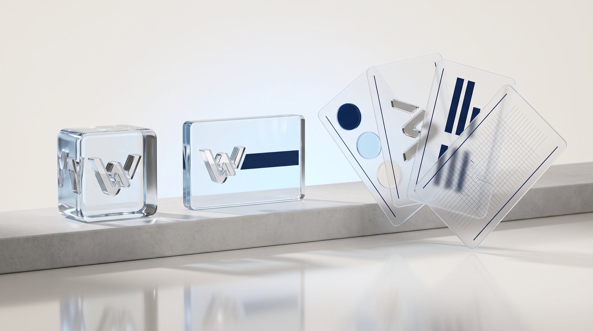
Corporate design is the visual side of a brand: the sum of all design means a company uses to present itself. The logo is one element among several, and rarely the most important one.
Six components make a system robust:
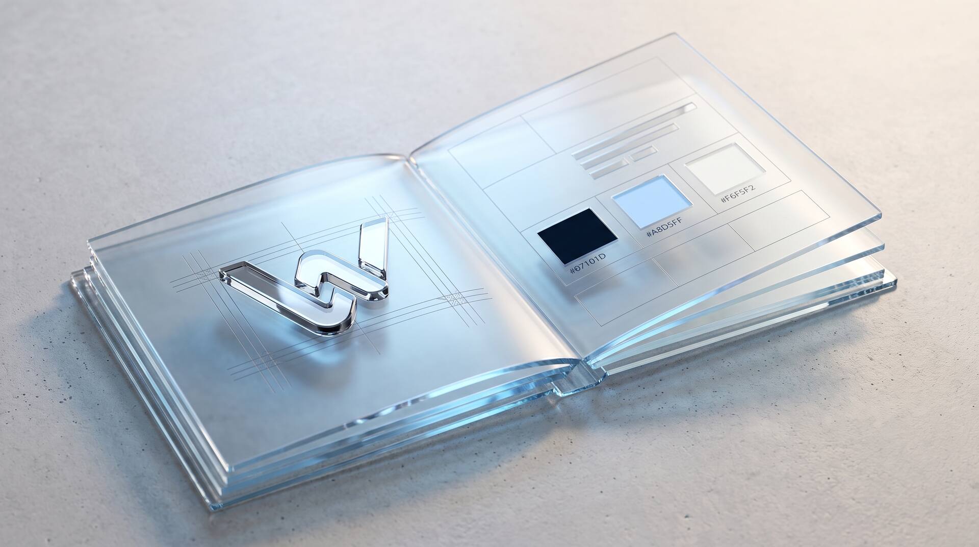
The brand mark in all variants: horizontal, vertical, as a symbol, in black and white, with clear space and minimum size.
The color palette with primary, secondary and functional colors, each with values for screen and print.
The typography with typeface family, size levels, line spacing and the rule for which level is used for what.
The imagery: not individual images, but the criteria by which images are selected or produced.
The design elements: grid, shapes, patterns, icons, use of white space.
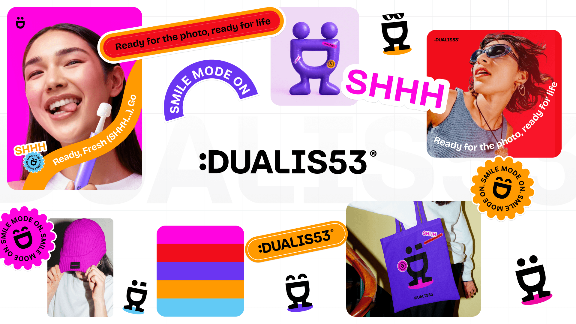
The applications: how all of this works together on the website, stationery, presentations, vehicles and trade fair booths.
If one of these points is missing, the gap doesn't appear immediately, but with the first use case nobody thought of.
The simplest quality test
Take an application nobody thought about during development, such as a trade fair booth or a vehicle, and try to produce it using only the documentation. If you get through without asking, your corporate design is complete. If a rule on color, type, imagery or grid is missing, you have found the gap before it gets expensive.
The difference between a logo and a system
A logo answers one question: What does the mark look like? A system answers all the others: What happens when the mark is on a dark background? What does a presentation slide look like? What color is a notice box? How big is the headline on a flyer?
These exact questions come up constantly in everyday use, and if you answer them anew every time, you create a presence that looks different from one application to the next.
That is the practical difference. A logo costs a few thousand euros and solves one problem. A system costs many times that and prevents a hundred small problems from arising.
The test: give an employee the task of designing a one-page customer information sheet. If they have to ask questions to do it, the system is missing.
Why consistency has more impact than creativity
Recognition comes from repetition, not originality. An unspectacular color that shows up consistently everywhere has a stronger effect than an original one that only appears on the website.
The reason is simple: people process brands in passing. They don't remember a specific appearance, but a pattern that builds up over many contacts. Every deviating contact sets this buildup back a little.
This has an uncomfortable consequence: an average but consistently applied corporate design beats an excellent one that is only half lived. The decisive part of the work doesn't happen in the design, but in the application.
How to recognize quality
Four characteristics distinguish a robust system from a pretty collection.
It works in black and white. A mark that only works in color fails with stamps, faxes and engraving.
It works very small. If the mark becomes unrecognizable as an app icon or favicon, it is too detailed. That is more important today than the effect on a trade fair banner.
It has rules for exceptions. What happens with an image as the background? With very little space? In a collaboration with a second logo?
It can be used without a designer. If every application has to go through an agency, the system gets bypassed as soon as things are urgent.
These four points cost little extra during development and decide its lifespan.
What it delivers and how to measure it
Corporate design is hard to measure directly. What can be measured are the effects.
Recognition. How many touchpoints does it take before someone associates you? That goes down with consistency.
Price acceptance. A presence that looks standard works against a price above standard. If you position yourself on quality, you pay twice with an interchangeable presence: once in perception and once in negotiating leeway.
Internal effort. How long does it take to design a presentation or a proposal? With a system: minutes. Without one: from scratch every time.
Job applications. With a shortage of skilled workers, your presence is part of how you are perceived as an employer. For many mid-sized companies, this is now where the investment pays off fastest.
When the effort pays off and when it doesn't
It pays off if you appear in several channels, if several people create material, if you position yourself on quality or if a growth step is coming up: expanding locations, a new target group, succession.
It doesn't pay off if you sell a single product to a few known customers, if referrals are your only sales channel or if you are planning a merger in two years. Then waiting is cheaper.
Between these two poles lies the normal case: a company that has grown and whose presence has grown with it, without anyone ever deciding that. There, a complete rebuild usually doesn't pay off, but putting in order what already exists does: defining instead of reinventing.
That is the cheapest option and, in practice, the one that most often makes sense.


More articles